Colloquial
Ready-to-Drink Packaging (RTD)
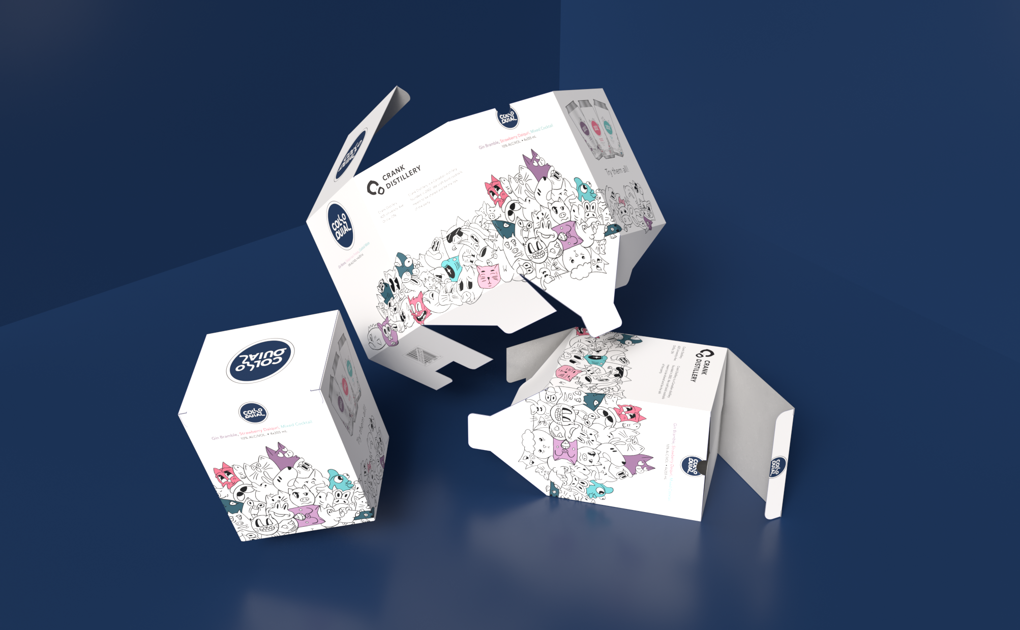
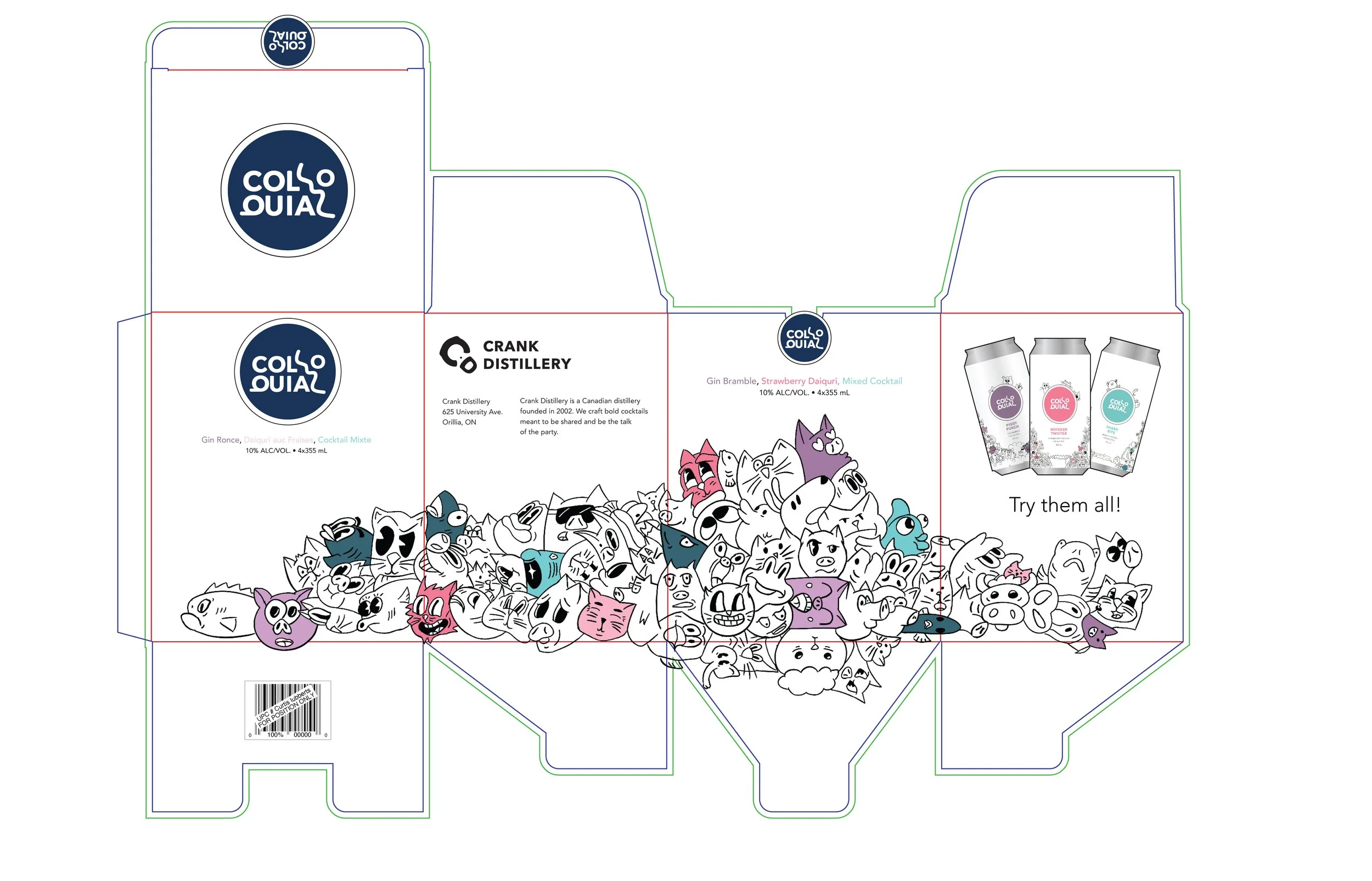
Colloquial is Crank Distillery’s ready-to-drink (RTD) lineup, meant to stand out on crowded LCBO shelves. Inspired by the idea of everyday, familiar language, each can visually references an English idiom, expressed through illustration rather than explicit wording. Each flavour uses a single pastel tone for a clean, modern look, while staying fully compliant with Ontario’s alcohol packaging regulations. The full series was released as a cohesive mixed pack. This project was my first foray into illustrated packaging, which taught me a great deal about researching and adapting classic illustration styles.
Client
Crank Distillery
Year
2024

Logo Mark
The logo mark was designed by taking the word, Colloquial, and breaking it into a less recognizable mark. Since each can was designed using a common English phrase, without obviously stating the phrase, the logo was treated in a similar way.
The right side of the logo creates the simplistic figure of a person or a face.
The Q on the right side has been flipped to add balance to the weight of the mark.
The typeface used is the parent companies typeface.
What’s a Colloquial?
Colloquialisms are a word or phrase that is not formal or literary, typically one used in ordinary or familiar conversation. The key element to this lineup is taking familiar idiom phrases and crafting friendly doodle styled to the words. Most importantly, doing so in a subtle way and without being too on the nose about the phrase being used.
The familiarity with the language and the brand will create a connection and a conversation.