Excalibar Branding & Menu
Excalibar is a board game restaurant with a flair of medieval style. I designed the brand and associated guide as well as a menu meant to boost the unique identity of the store.
Client
Excalibar Restaurant
Year
2025
The Brand
Excalibar (Excali‑bar) is a Canadian board‑game restaurant with a medieval theme, drawing inspiration from the legends of King Arthur and his famous sword, Excalibur.
The space offers a cozy atmosphere built with traditional materials like wood, brick, and stone, giving real texture to everything around you. Excalibar’s environment is designed to embody warmth and community, bringing a sense of home and handcrafted care to every part of the experience. The brand aims to welcome not only seasoned tabletop gamers but also beginners, opening the doors to a wider clientele. This reflects a larger movement within the gaming community, inviting new players in and encouraging those who may not have been involved before to connect in a friendly, inclusive space.
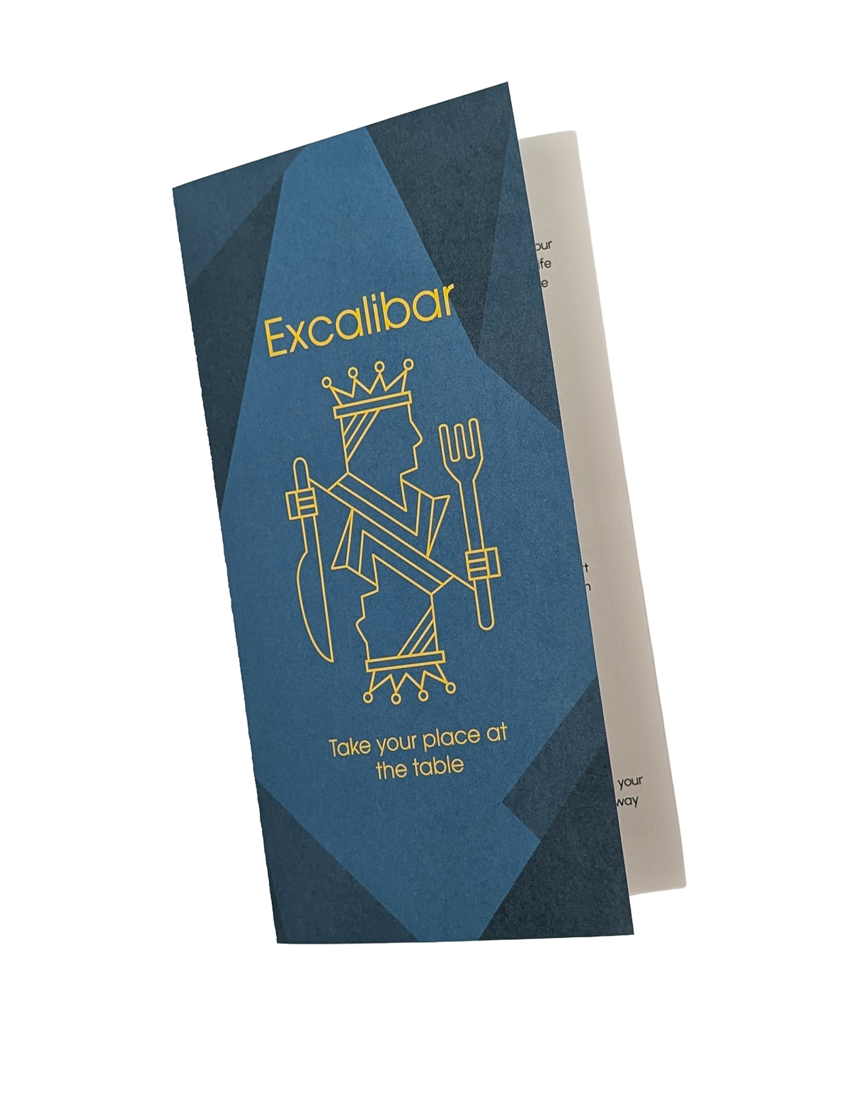
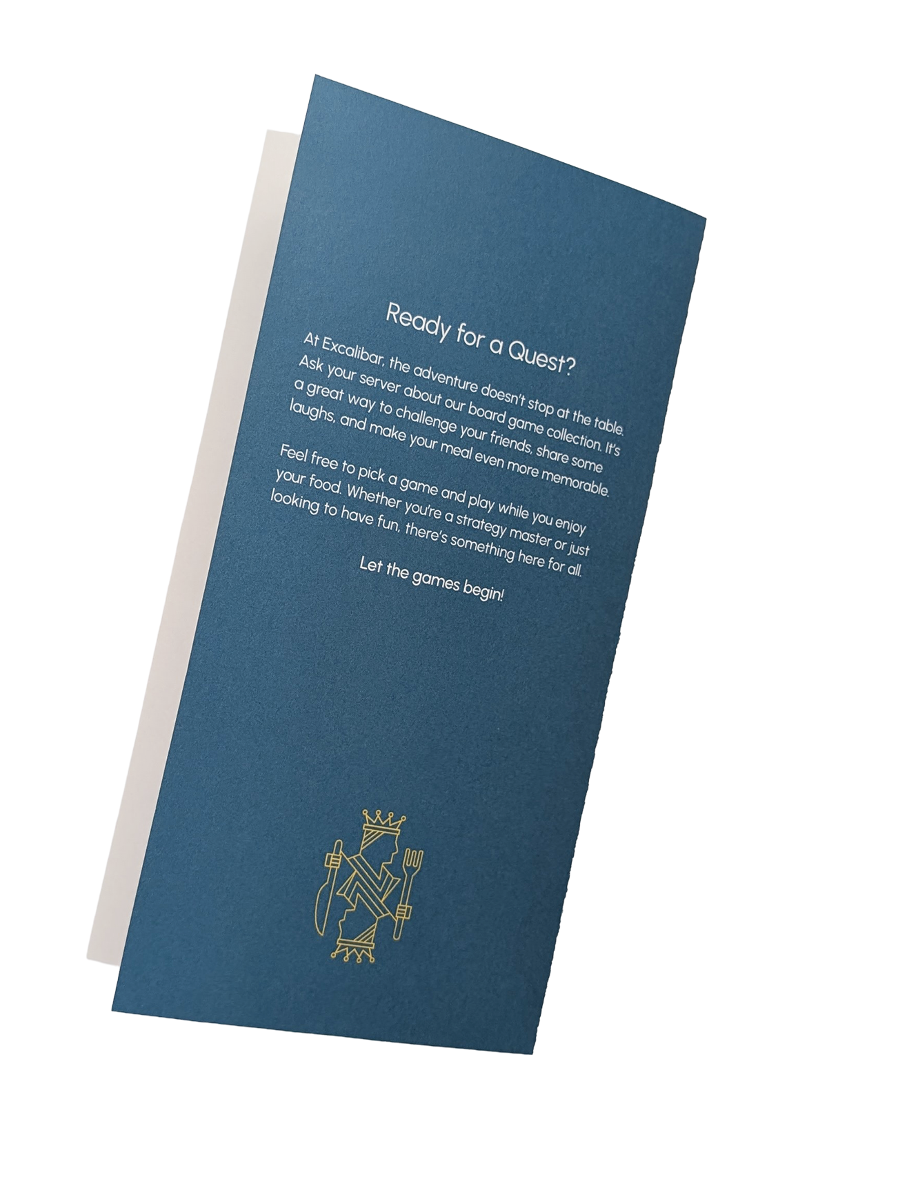
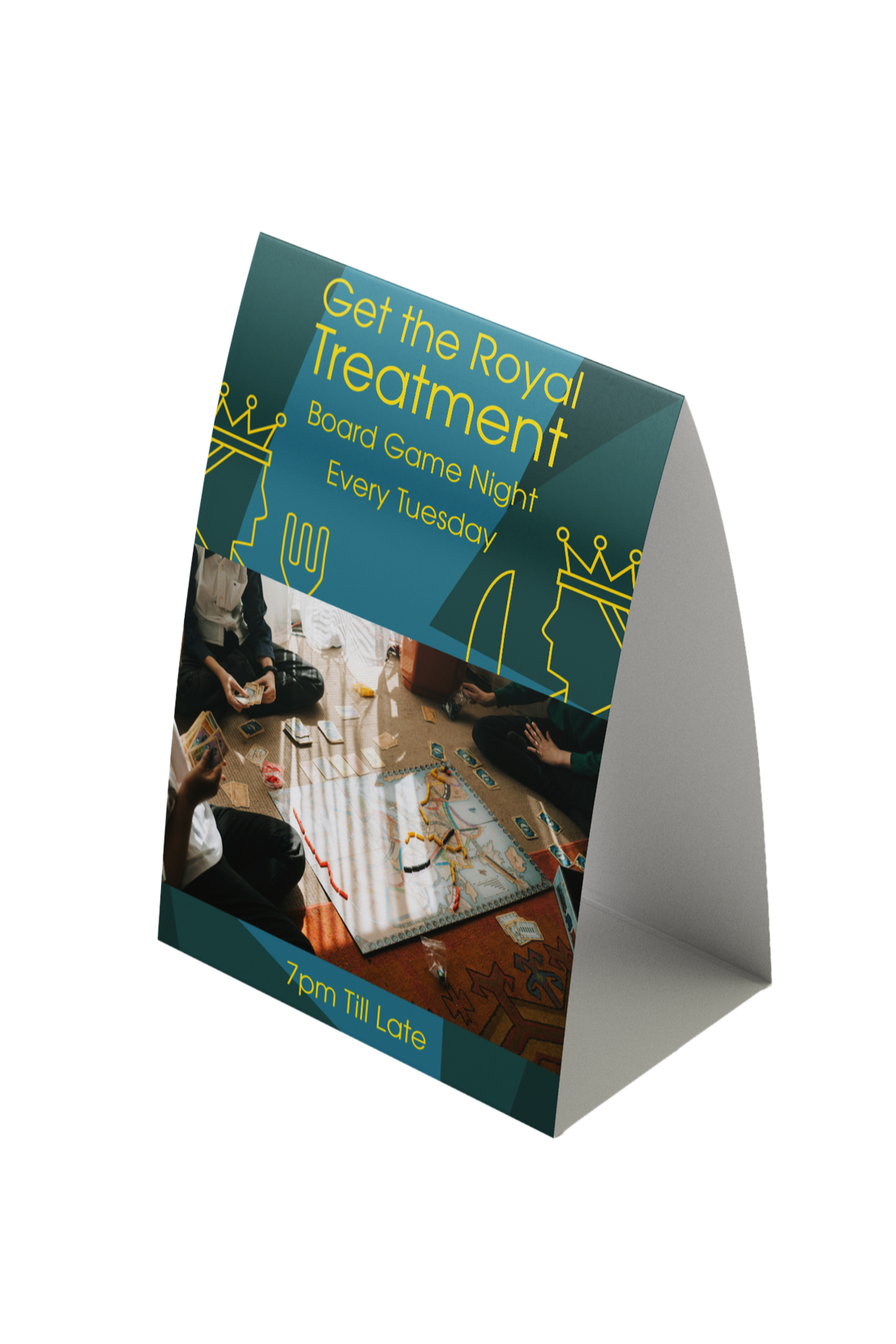
Take your place at the table.
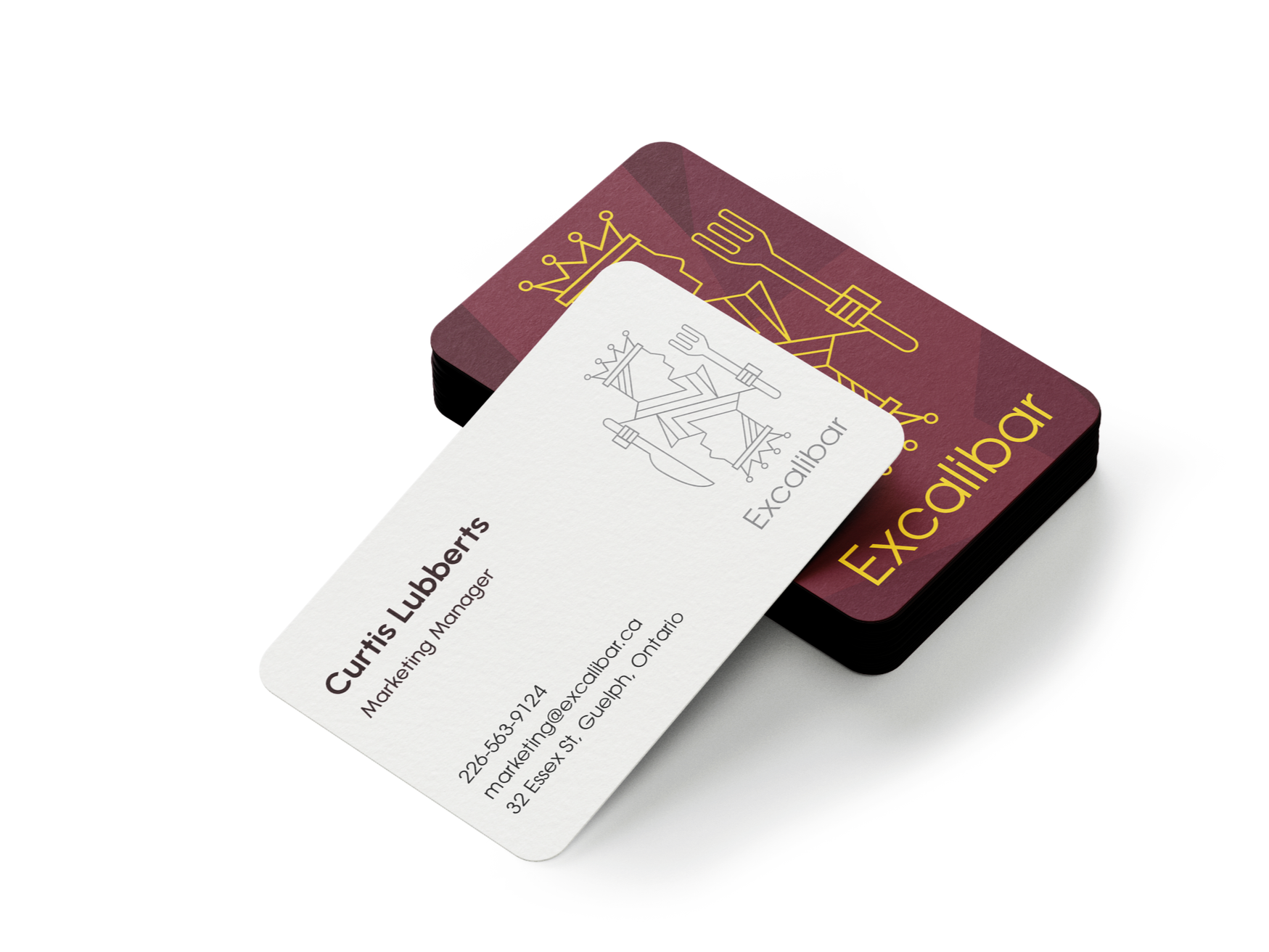
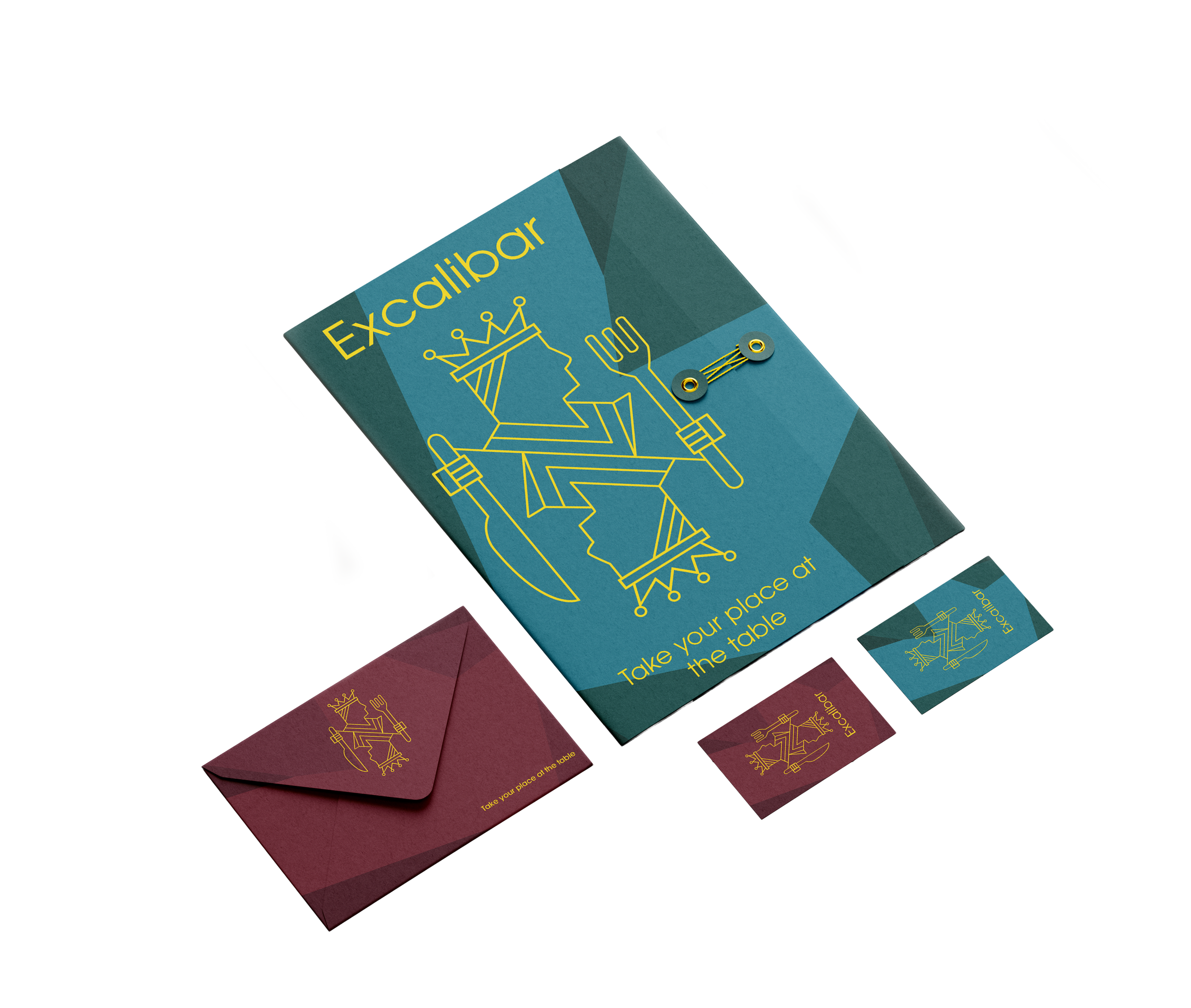
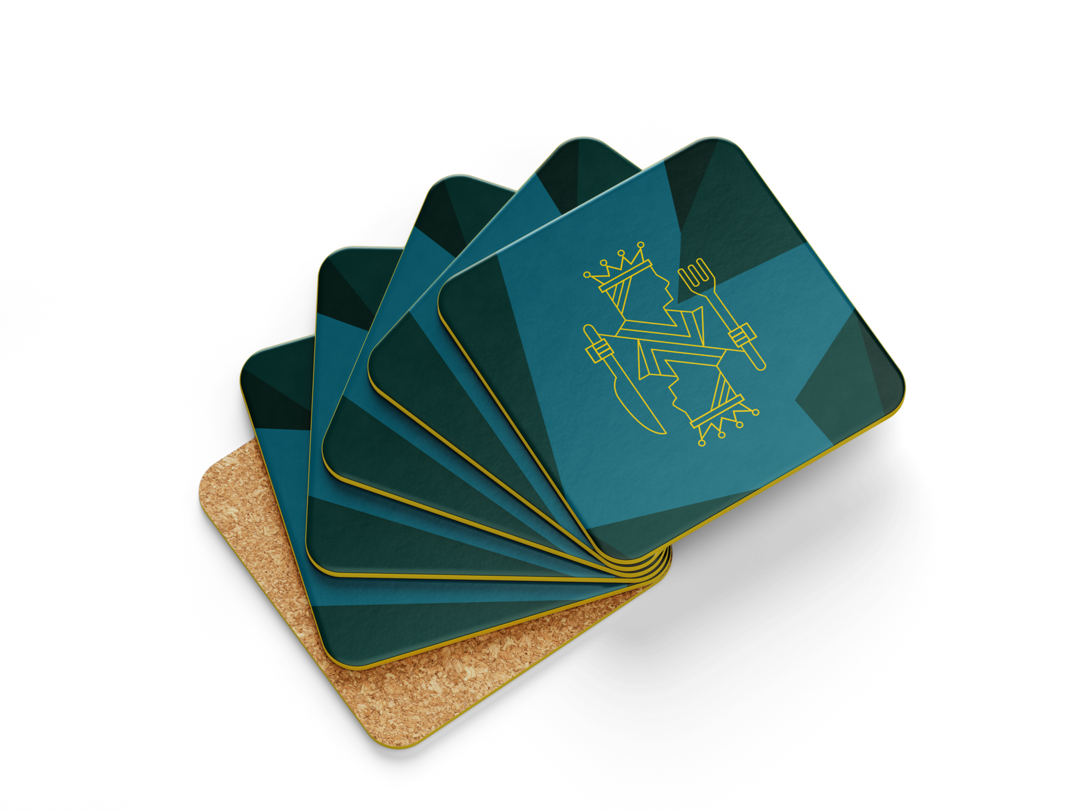
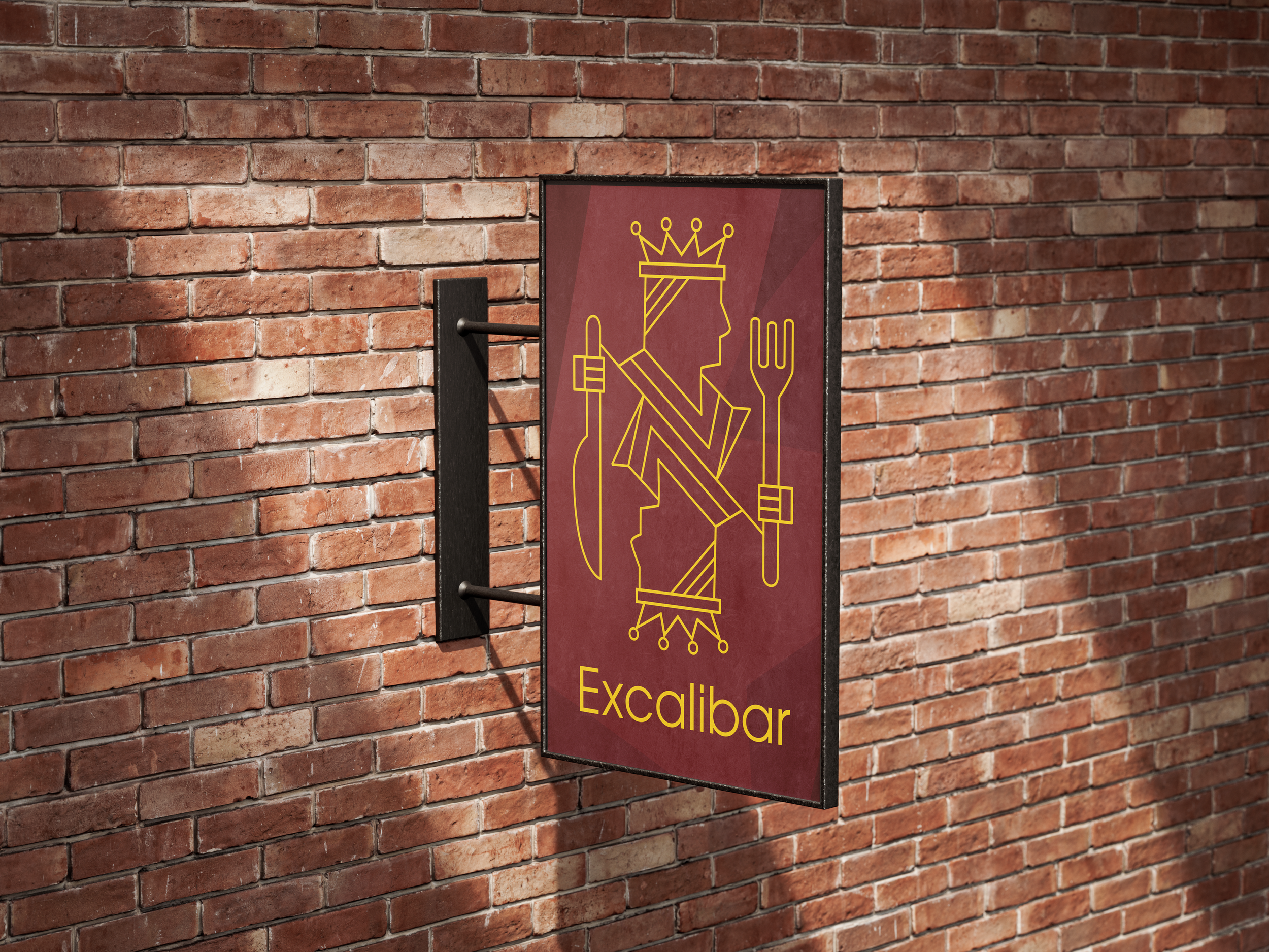
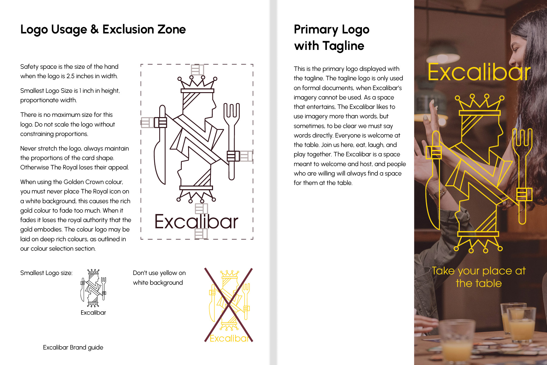
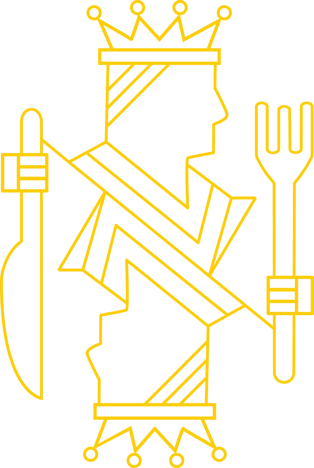
Logo Mark
The Excalibar Logo is based off of the traditional playing card, combined with the two most commonly used eating utensils. This split design, featuring a two faced card and the utensils, balances the eating and the gaming aspects of the Excalibar. The icon itself is meant to keep a gender neutral, non-demographic specific look, because anyone can be royalty here. The worthy can pull the sword from the stone (or the cake…) and best their friends in board game combat.
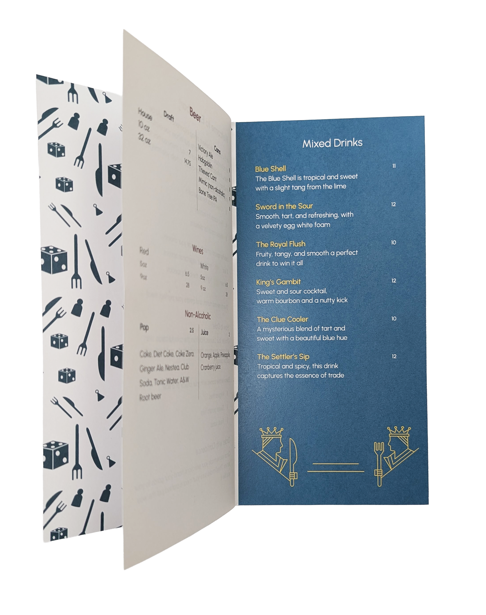
The Menu
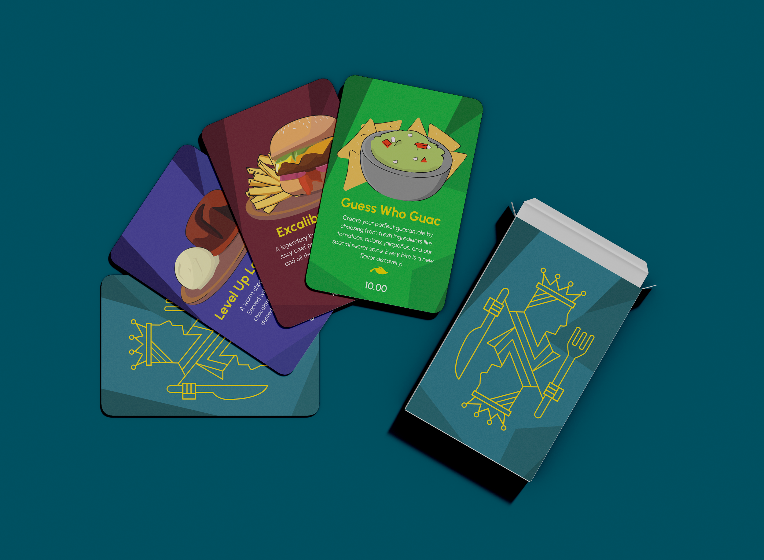
Excalibar had a more traditional menu, with three pages displaying all their drinks, appetizers, mains, and desserts. Inspired by their brand, I designed a card system for their kitchen delivery orders, along with a separate, simplified drink menu that can be kept on busy tables, since space is a commodity for their board‑game‑playing customers.
Each menu card was colour‑coded, similar to how board games use easy‑to‑recognize patterns. Appetizers are green, mains are red, and desserts are purple. The geometric patterned background was carried across all cards, drawing inspiration from the style of the logo. All menu items were illustrated; rendering food in this way creates the whimsical, handmade atmosphere that games like Settlers of Catan or Ticket to Ride evoke for players.